

Dreamy Fizz
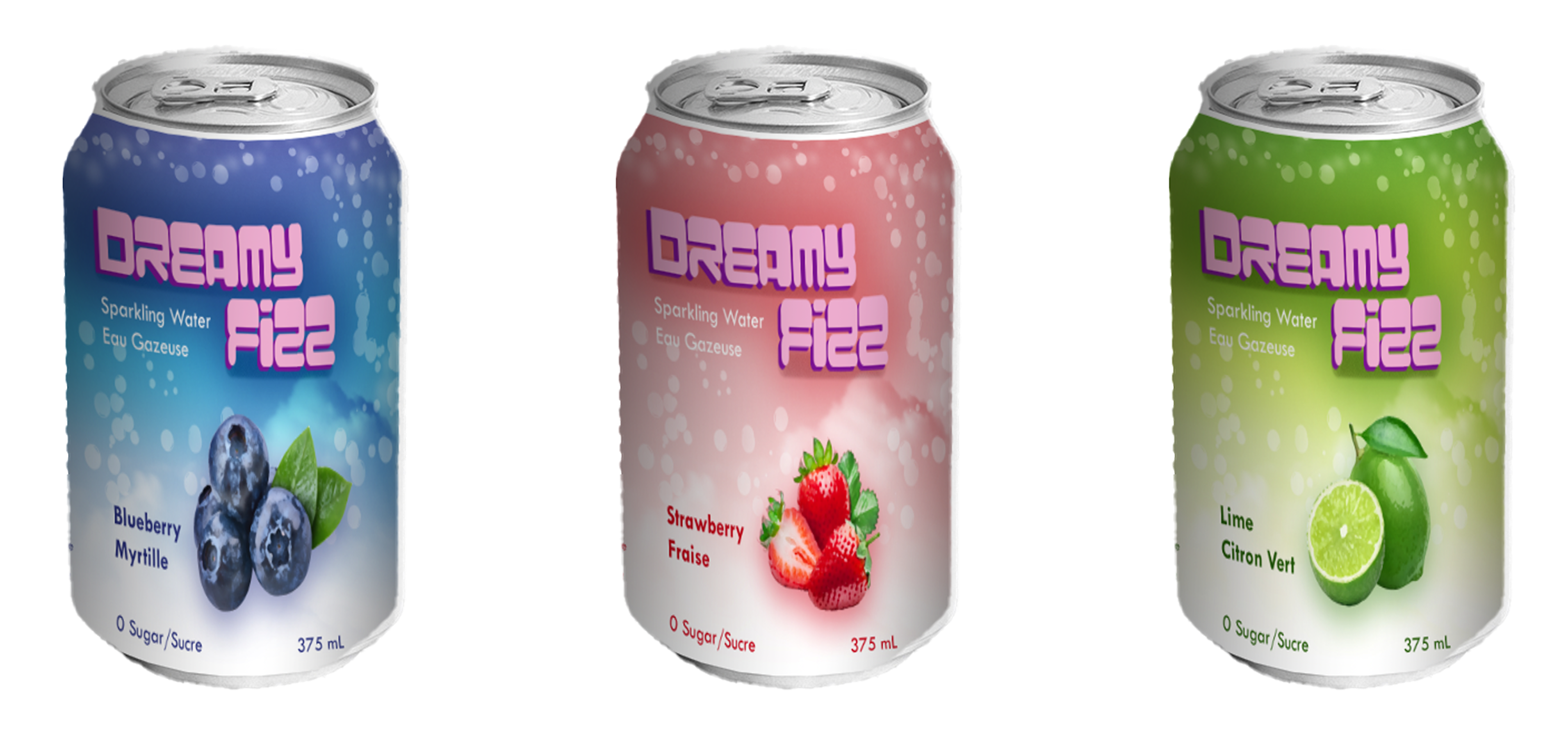
Canned sparkling water featuring 3 different flavours, Blueberry, Strawberry, and Lime.
Project Overview
Dreamy Fizz is canned sparkling water made with 100% natural flavors and contains zero sugar. The branding features a bubbly, dreamy theme to reflect its refreshing and light nature.
Concept Design (2 weeks)
Brainstorming
The first week focused on brainstorming ideas for a beverage to create a product label for. The goal was to design a visually appealing label that conveyed a sense of fun and dreaminess.
Product Selection
After considering various options, sparkling water was chosen as the product. It was the perfect choice to create a fun and dreamy beverage.
Flavor Selection
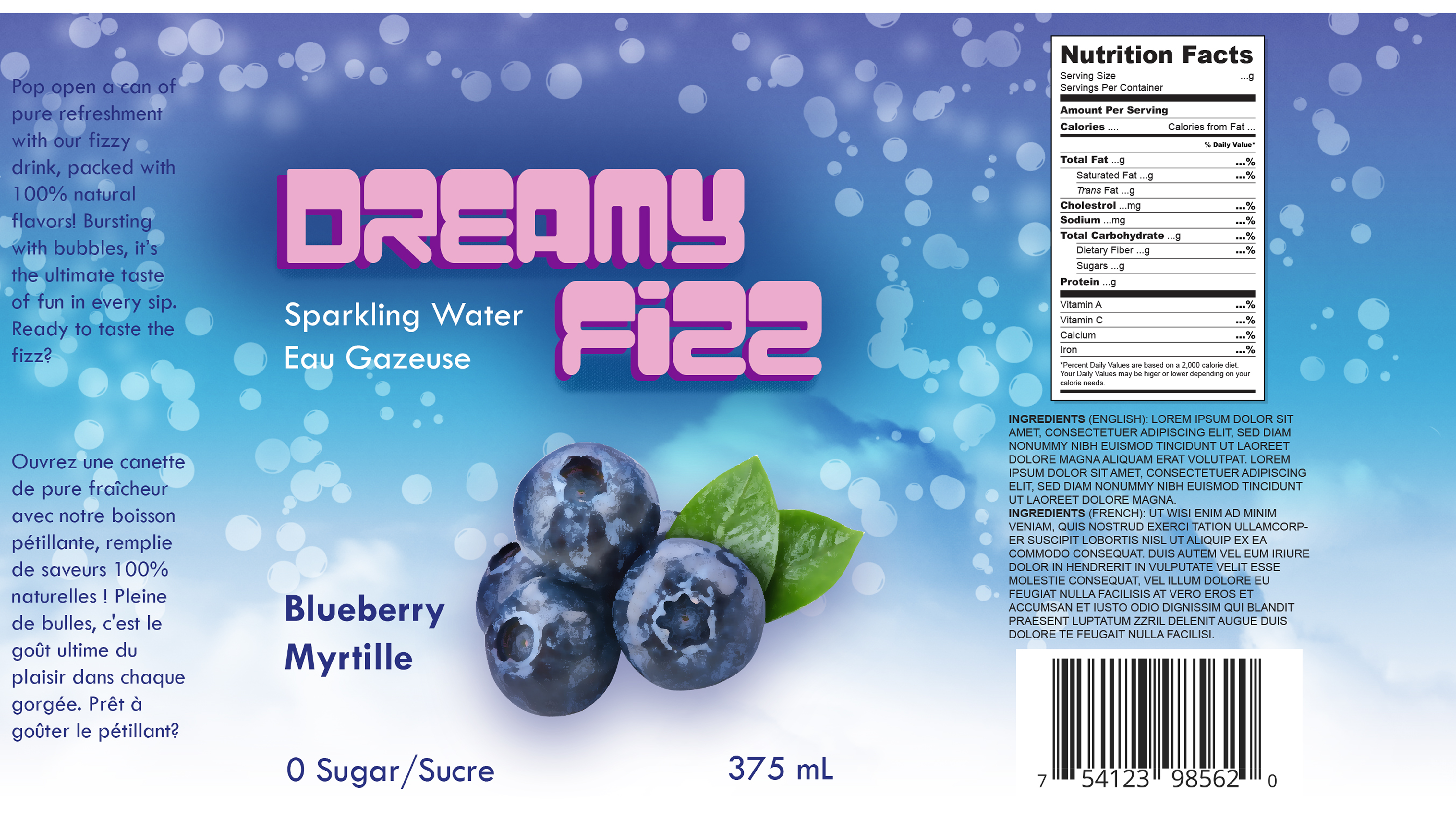
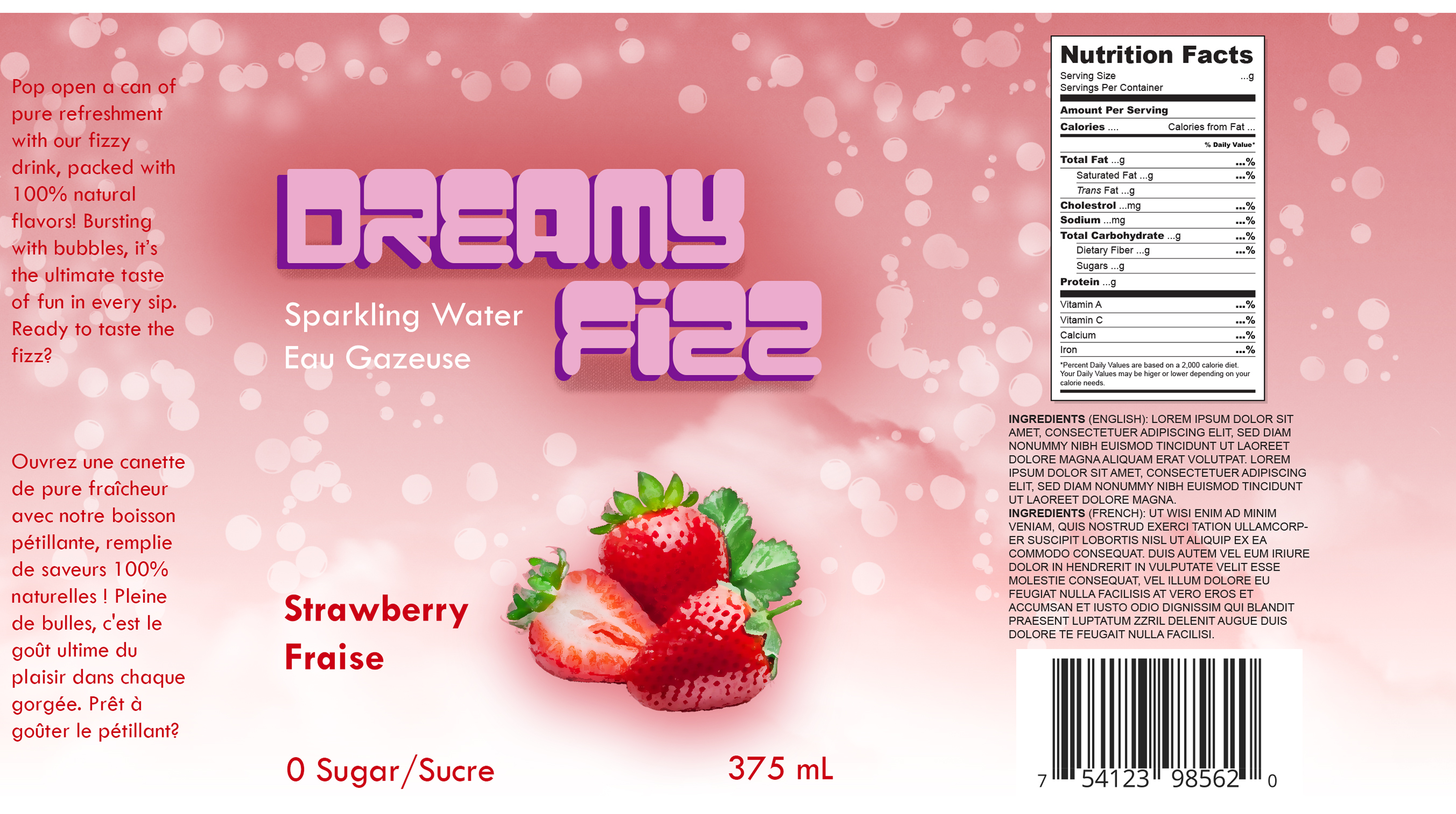
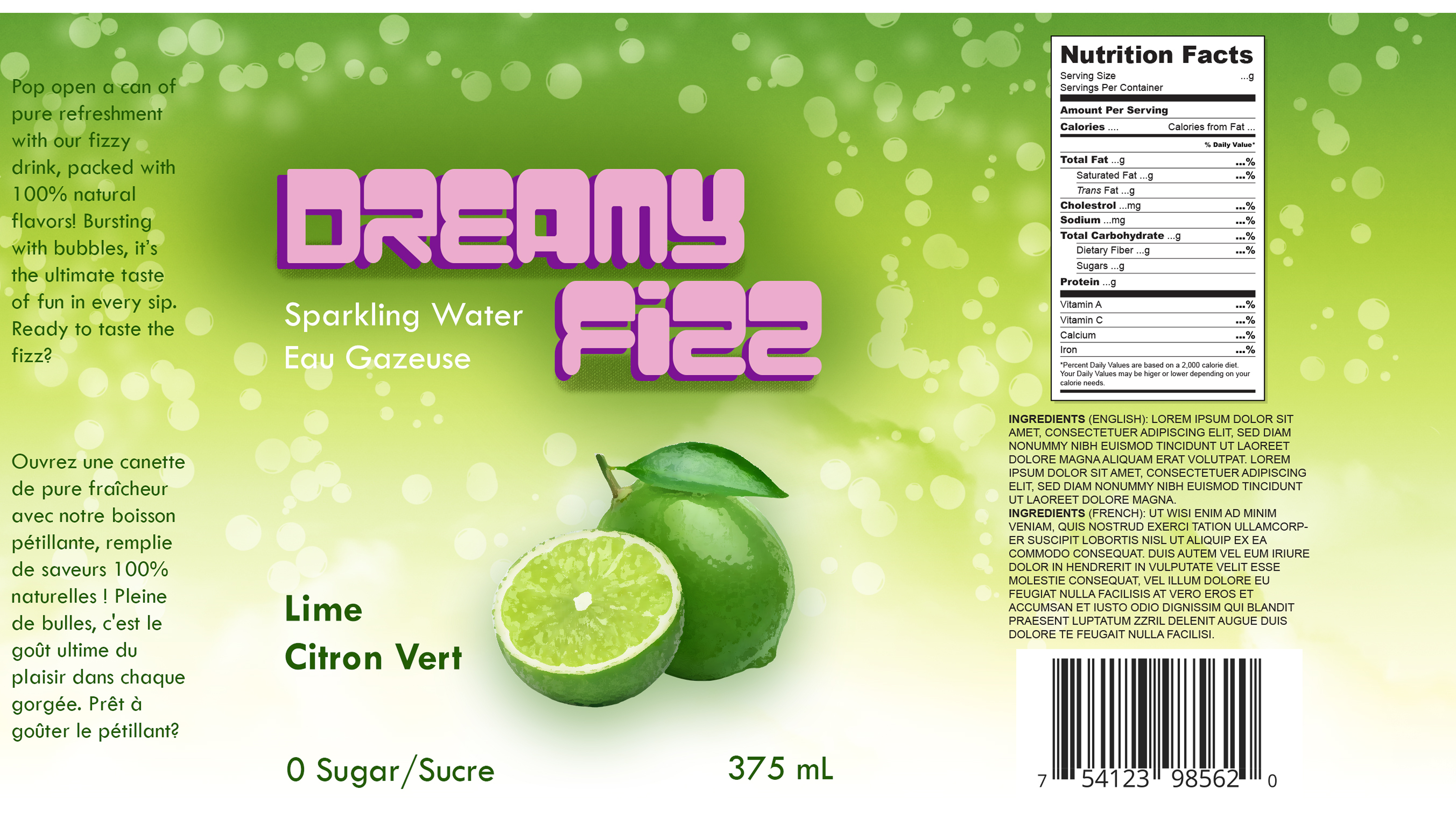
Three popular, refreshing fruit flavors was selected: blueberry, strawberry, and lime. These flavors are not only well-loved but also have vibrant, natural colors that complement the bubbly aesthetic.
Branding & Messaging
The branding creates a strong visual identity with clear messaging. The flower icon symbolizes calmness and growth, while the color palette features blue for tranquility and reliability and yellow for happiness and positivity. This design reinforces the goal of providing a safe, engaging space for mental well-being and encouraging daily mindfulness practices.
Title Design
This beverage is named “Dreamy Fizz” to highlight both its bubbly nature and its dreamy vibe. To reflect this, round and bubbly typography that evokes the sensation of bubbles was used to create the title. Pink and purple were chosen as the core colors, keeping the design fun, light, and dreamy, while also ensuring the label would stand out on shelves.
Branding & Messaging
The branding focused on creating a playful and dreamy experience for consumers while highlighting the natural ingredients and health benefits. Dreamy Fizz was marketed as a fizzy, all-natural sparkling water with 100% natural flavors and zero sugar. This messaging targeted health-conscious individuals who wanted a fun, fizzy drink without compromising on wellness.
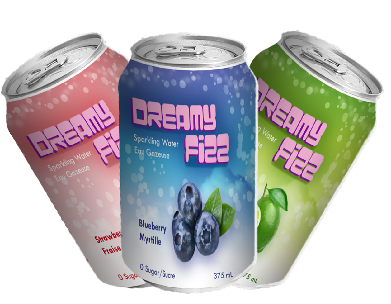
Product Image & Visual Design
Images of each fruit was added for each flavor(blueberry, strawberry, and lime) and placed on colorful backgrounds matching each fruit’s natural colors. Blueberry has a soft blue background, strawberry a light pink, and lime a fresh green. To enhance the dreamy aesthetic, soft cloud images was used in the background and floating bubbles were scattered across the label design.
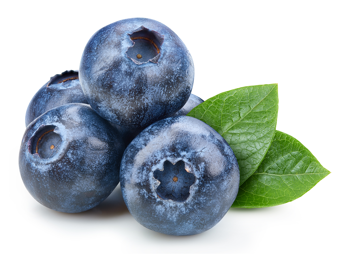
Blueberry
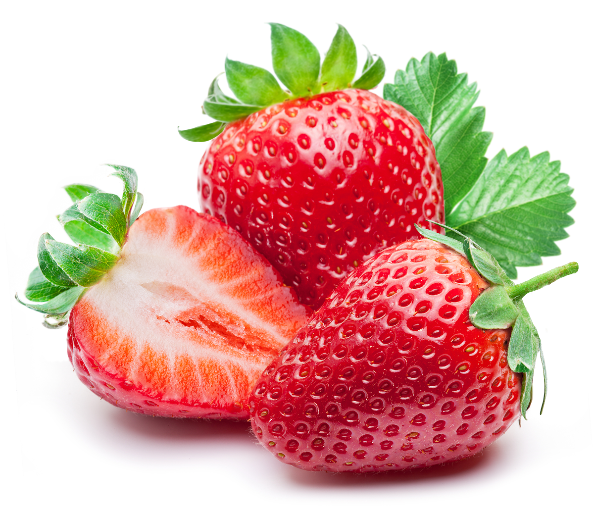
Strawberry
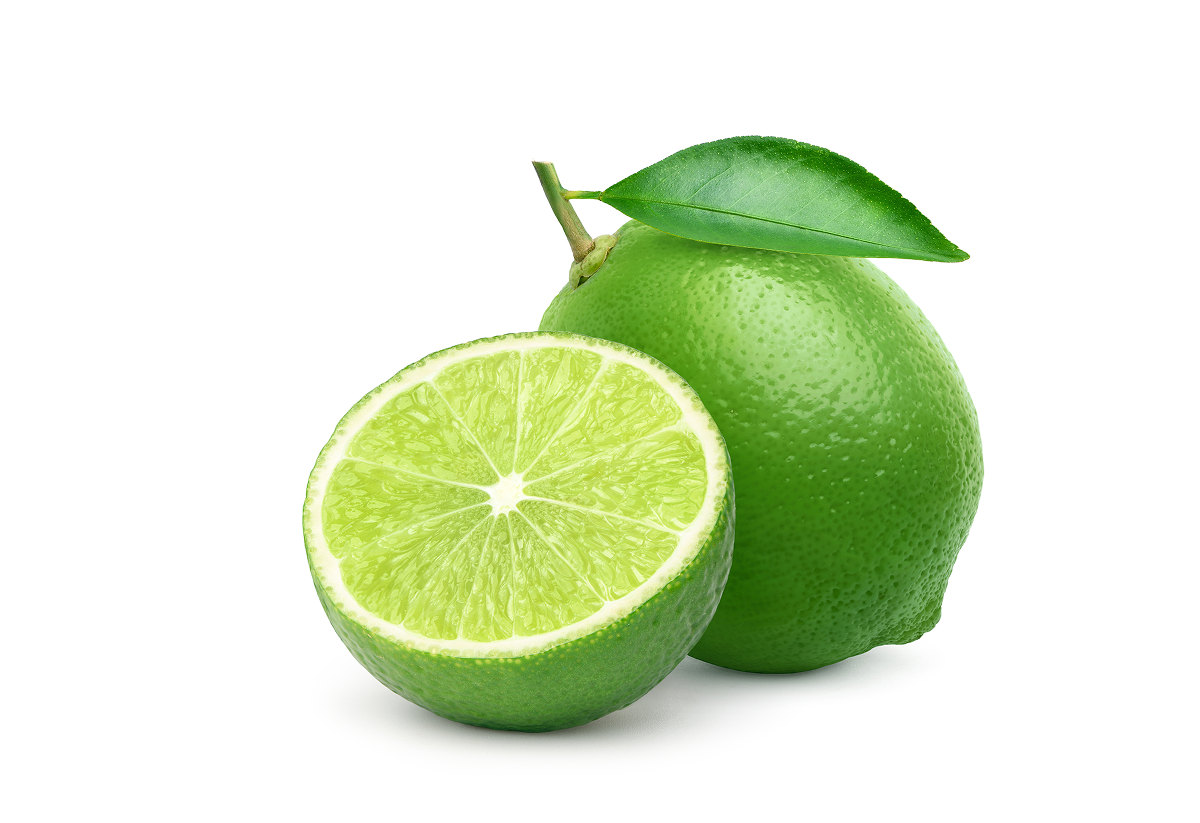
Lime
Mockup Creation
To visualize how the labels would look on the actual product, a mockup of the product was created by placing the finalized labels on a can template. This step was essential to ensure the design translated well onto the product packaging, and ensuring proportions, text readability, and the overall aesthetic works in a real-world context.
Refining & Finalizing the Design
Fine-Tuning
After reviewing the designs for consistency across flavors, final adjustments were made so that the only significant differences between the labels were the color themes corresponding to each fruit. This approach maintained visual harmony while giving each flavor its distinct identity. The placement of text, color balance, and overall aesthetic were refined to align with the brand's playful and bubbly aesthetic.
Editing
In the final editing phase, adjustments were made to comply with Canadian product regulations by translating all the text into both English and French, ensuring the label met regulatory requirements.
Software Used
Adobe Photoshop