

GoldiBite
A food safety app for travelers with food allergies or sensitivities.
Project Overview
GoldiBite is a mobile application designed to enhance user safety by providing quick and reliable assistance in the event of food reactions. The app empowers users with tools and resources to respond promptly and effectively to unexpected situations, ensuring they can handle and prevent emergencies with confidence and peace of mind.
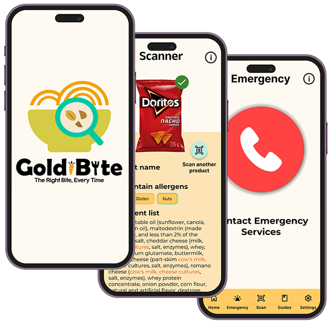
GoldiBite Features
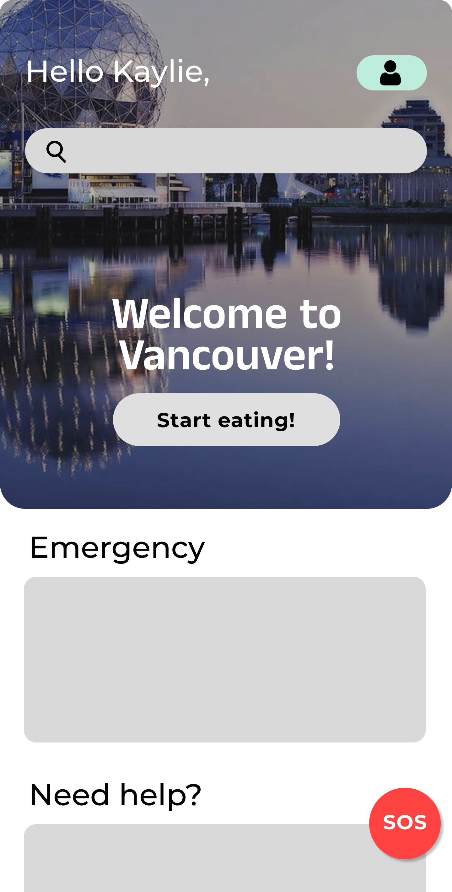
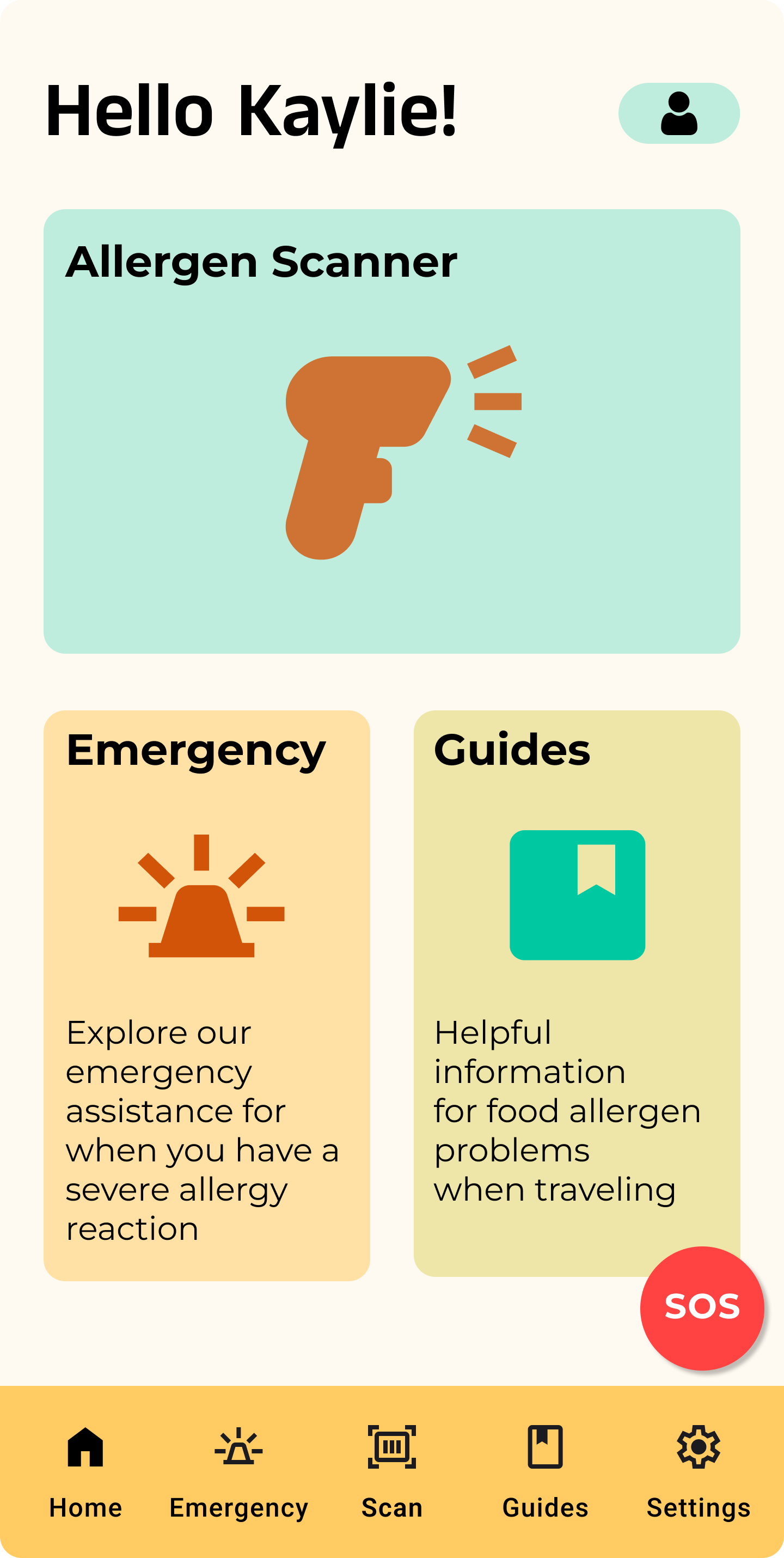
Seamless Accessibility & Usability: Designed for everyone, with simple onboarding, clear navigation, and a clean layout, making it easy to find important information quickly.
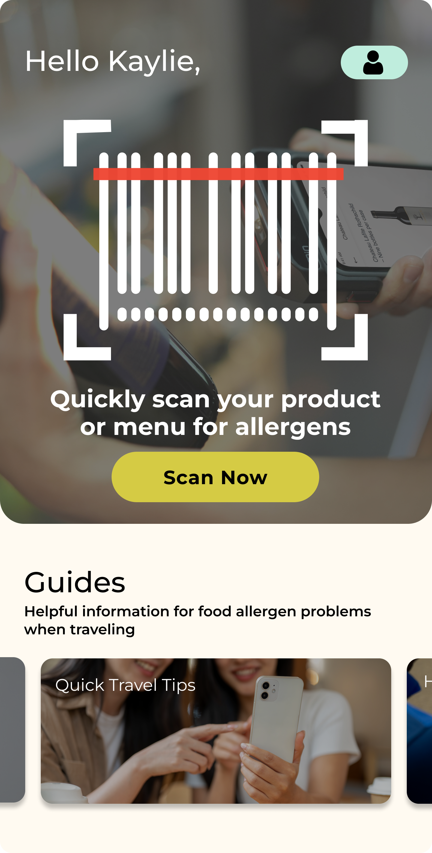
Travel Assistance for Allergy-Safe Experiences: Helps users stay safe while traveling with allergen translations, guides, tips, and a menu and product scanner with language translations.
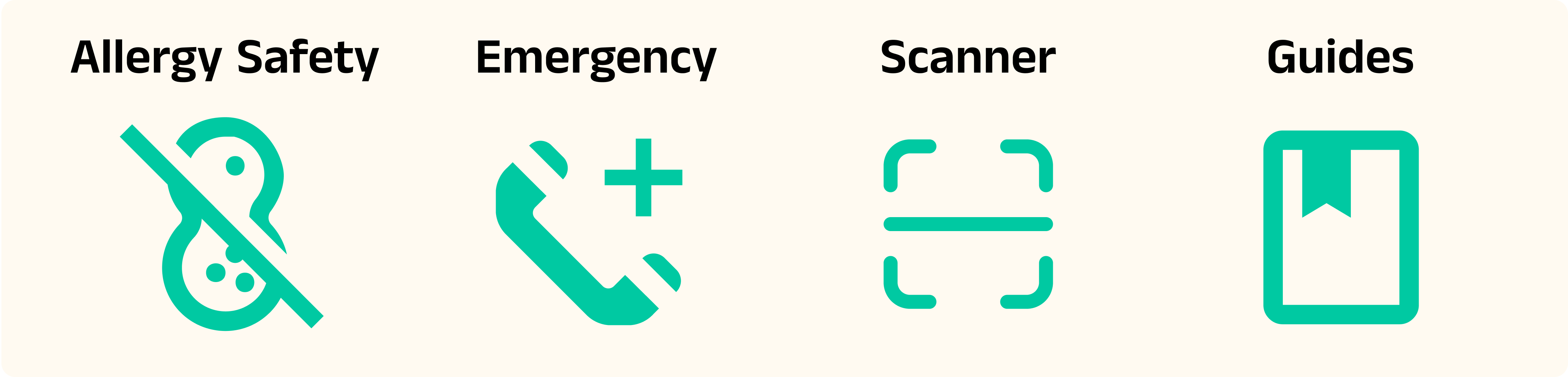
Core Values & Impact
Safety First: Instant access to vital allergen information, reducing health risks in emergency situations.
Global Accessibility: Localized data, emergency hotlines, and allergen regulations adapted to different regions.
Enhanced Usability: Unlike many food safety apps that overwhelm users, GoldiBite is designed for effortless navigation and clarity.
Freedom & Confidence: Whether at home or abroad, users can trust GoldiBite to help them make safe dining decisions with ease.

Concept Design (4 months - UI/UX Designer)
Brainstorming and Ideation
GoldiBite was created to solve a real problem faced by individuals with food allergies and sensitivities. The idea stemmed from the experience from one of our team members’s best friend. She was a 17-year-old diagnosed with celiac disease. Adjusting to a gluten-free diet was challenging, but traveling to Mexico made it even harder. The language barrier and unfamiliar ingredients made every meal stressful, raising concerns about hidden allergens and emergency preparedness. This experience highlighted the need for a reliable food safety solution for travelers.
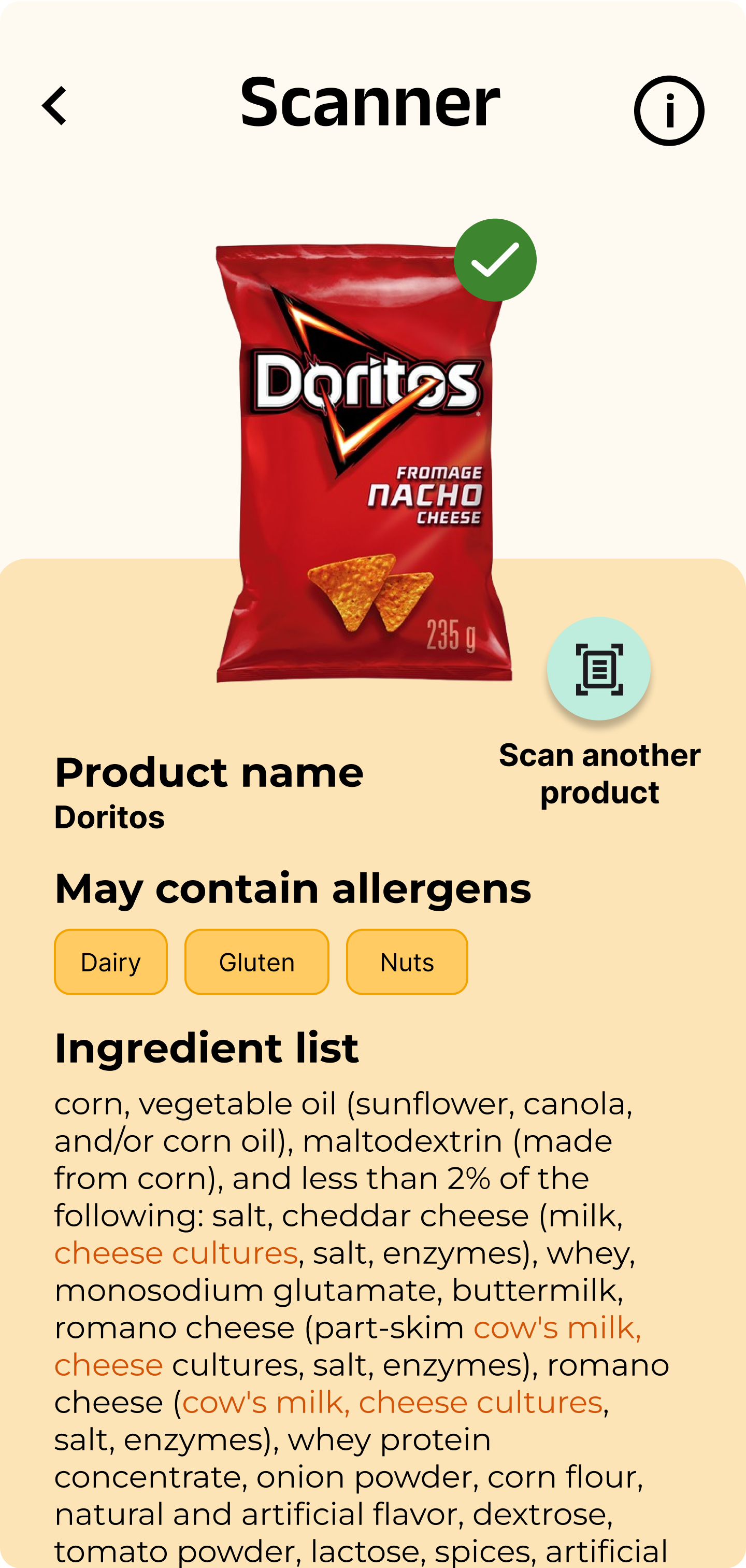
To address this, extensive user research on food allergies and dietary restrictions was conducted. User surveys revealed common challenges like reading food labels, dining out safely, and managing allergies while traveling. These insights shaped key features, including an AI-powered food scanner that detects allergens from images, text, and barcodes, reducing manual input. The app also provides a simple onboarding process for setting dietary preferences and receiving personalized recommendations. By making food safety information more accessible, GoldiBite helps users eat confidently and travel without worry.
Scanner
Scan Results
User Research & Personas
Through primary research, including a survey of individuals with food allergies, common allergens such as nuts, dairy, and shellfish was identified. To prevent allergic reactions, many respondents rely on meticulous label reading, carrying epinephrine auto-injectors (EPIPEN), and clear communication when dining out or traveling. Secondary research, including discussions on Reddit and relevant blog posts, provided insights into the experiences and restrictions faced by individuals with food allergies and sensitivities. This highlighted the emotional impact of allergies and the need for accessible resources.
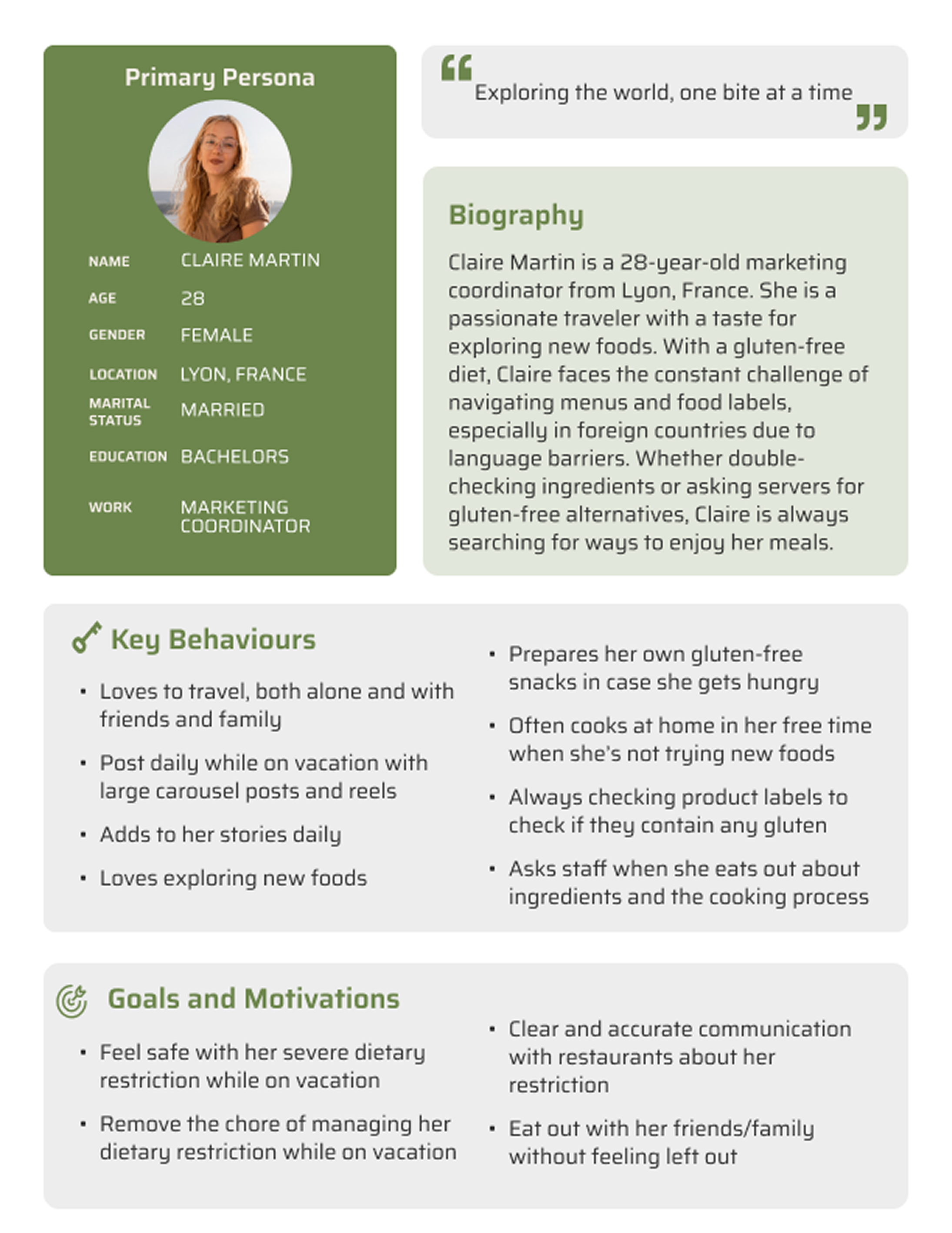
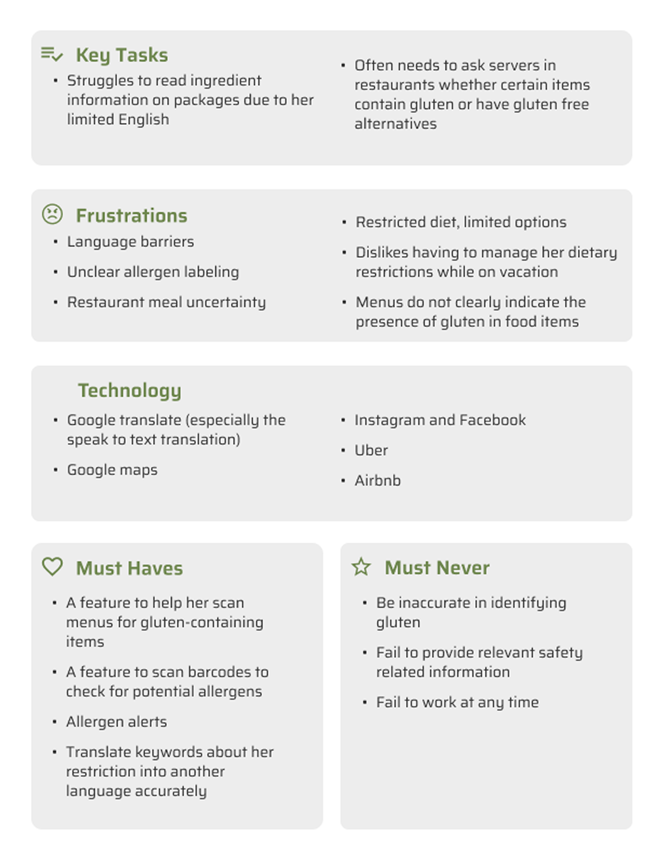
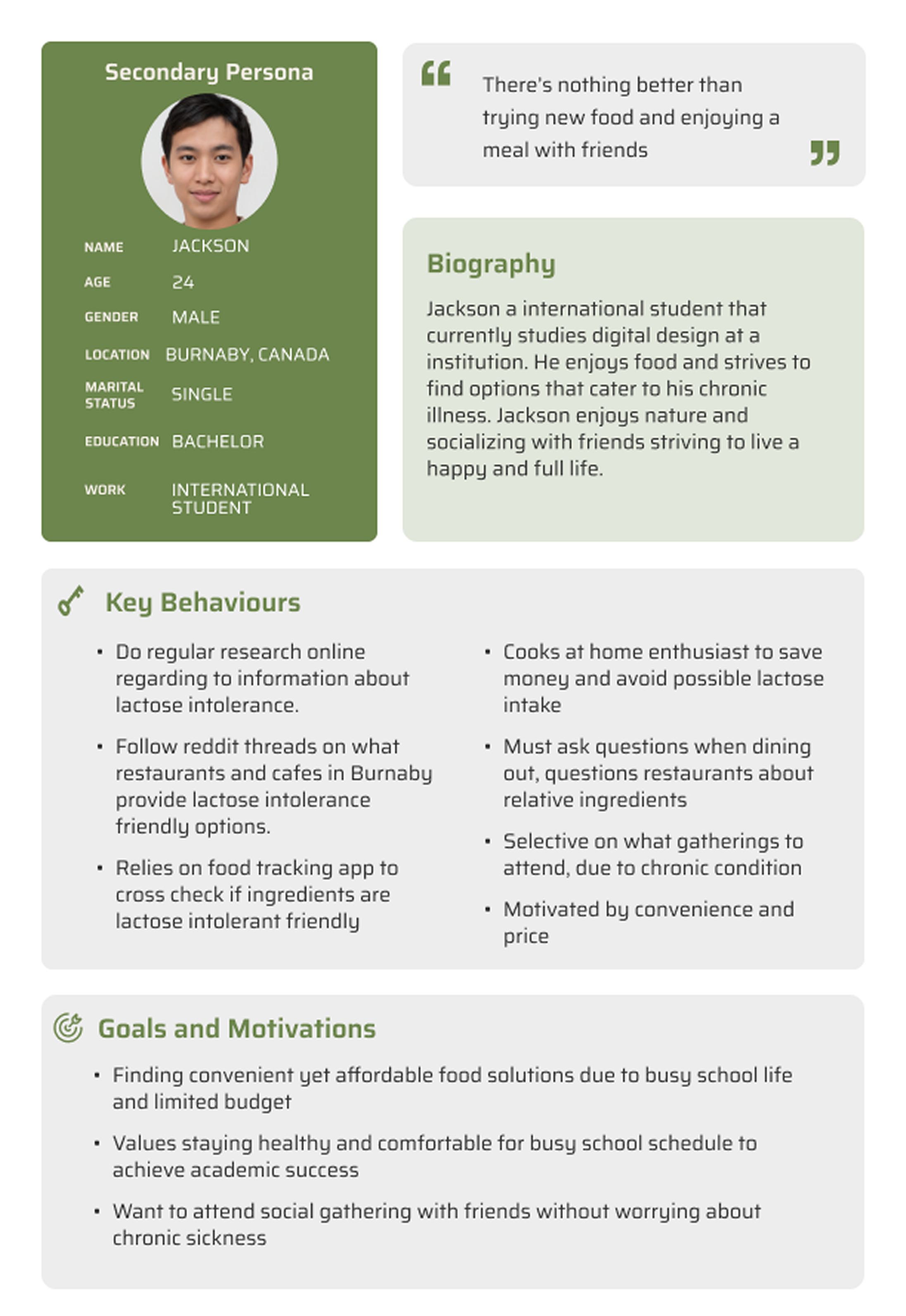
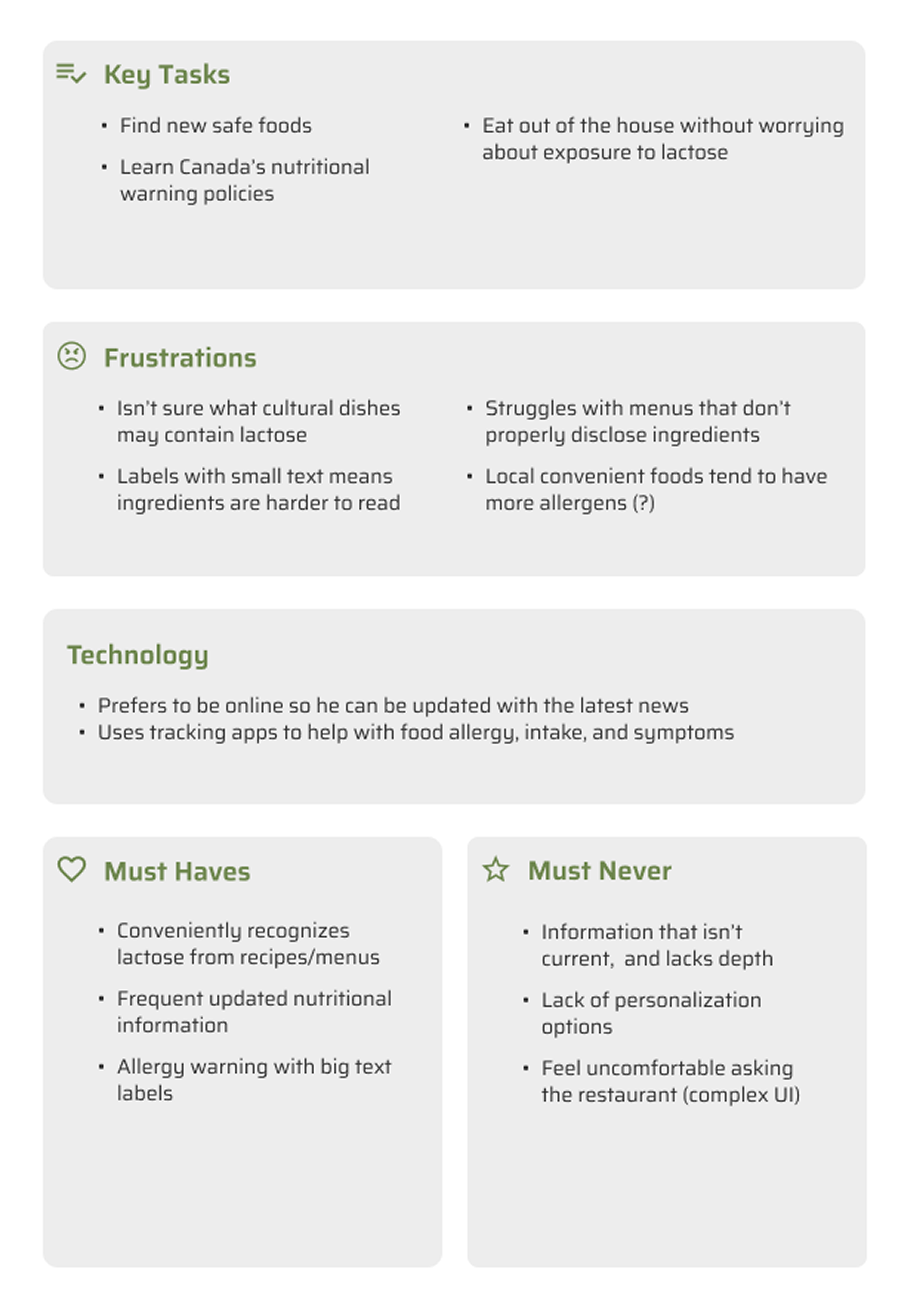
User personas were developed based on the user research done. Meet Claire and Jackson – two representative users who embody the real-life challenges GoldiBite aims to solve highlighting key user pain points and expectations.. These insights shaped the app’s intuitive workflows and accessibility-first approach.
Claire
Jackson
Designing Wireframes and Prototypes
To map out the app’s flow and system process, a site map was created to organize the main features. Low-fidelity wireframes were designed based on this map to visualize the layout. Prototyping these wireframes allowed for usability testing, where testers provided feedback on navigation, readability, and accessibility. Based on this feedback, the prototypes were refined, leading to the creation of a high-fidelity wireframe with a clean, minimalistic design that incorporated the app's branding colors. The final design focused on clear typography, high-contrast visuals, and intuitive icons, ensuring an engaging and user-friendly experience.
Wireframes
Low Fidelity Ver 1
Low Fidelity Ver 2
High Fidelity
Refining & Finalizing the Design
External Testing
External usability testing was conducted with five testers that were either instructors or friends who had no prior knowledge of the app. Their feedback focused on navigation, clarity of content, and general user experience.
Navigation Issues: Testers were unsure where to begin and had difficulty understanding the calls to action. One tester was confused by the barcode scanner animation, mistakenly thinking they could scan a product immediately without additional steps. Another tester struggled to decide whether to use the barcode scanner or the emergency feature first. A recommendation was made to show the barcode scanner first, followed by the emergency feature, to reduce confusion.
Guide Content: Some testers felt that the guides were either redundant or needed more context. For example, one tester liked the "traveling with someone with nut allergies" guide, suggesting that all guides should be more situation-specific and practical. The "How to use an EpiPen" guide was critiqued for assuming prior knowledge of the device. Testers suggested adding more basic information, such as "What is an EpiPen?" or "What is anaphylaxis?"
Home Page Confusion: The home page layout was found to be confusing as some Testers were unsure how to proceed or where to go next. There was feedback suggesting that the home page should be more organized with clearly defined sections, and that it should be scrollable to improve usability.
Menu Scanner: Testers suggested incorporating the ability to scan QR codes from digital menus, which would help travelers who encounter these menus in restaurants. This addition would allow the app to break down menu items and ingredients for users with dietary restrictions.
Minor Issues: Testers identified some minor issues, such as spelling errors (e.g., "epipen" instead of "EpiPen") and suggestions for improving the home page’s image organization. Additionally, some testers noted that the text in certain guides was too lengthy and would benefit from being more concise and user-friendly.
Conclusion: Overall, testers suggested improvements to the navigation flow, clearer and more practical guide content, and a better-structured home page. These changes would enhance the app's usability and make it more intuitive for users who are unfamiliar with its features.
Fine-Tuning
Several key app features and screens were refined based on user feedback from testing. Additionally, new micro-interactions and animations were integrated to further enhance the overall user experience. The main focus toward the end of the project was on improving the layout, performance, and usability.
Editing
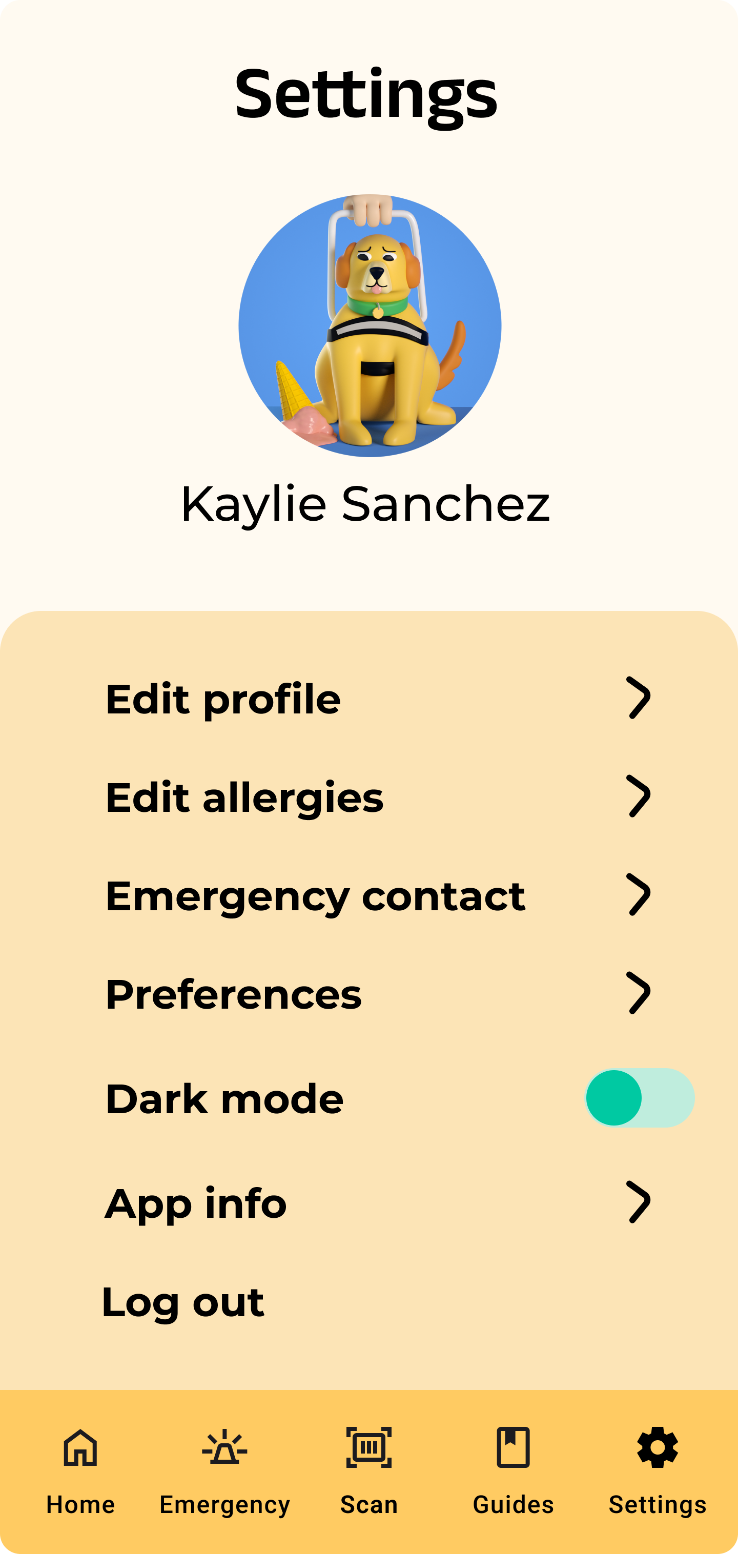
Internal and external testing helped identify and address issues with interactions, design, and text. After gathering detailed feedback, several improvements were made to enhance usability and ensure a more intuitive experience for users. More A/B testing and external testing were conducted to gather additional insights and continue optimizing the home page. Furthermore, Dark Mode was added, which enhances accessibility, reduces eye strain, and extends battery life.
Key Insights
Outcome
The final design of GoldiBite offers a user-centric experience that prioritizes safety and accessibility. The app's intuitive interface allows users to quickly access vital information during emergencies, and features like Dark Mode enhance usability in various conditions. Through thoughtful design and rigorous testing, GoldiBite effectively supports individuals in managing food-related emergencies with confidence.
Challenges
The primary challenge was creating an intuitive and user-friendly interface that enables users to quickly access critical information during emergencies. The design had to strike a balance between simplicity and functionality while seamlessly integrating AI features, ensuring that users could navigate the app easily even in stressful situations. Additionally, incorporating features like Dark Mode required thoughtful design to maintain visual accessibility while reducing eye strain.
Another key challenge was developing a flexible system that could accommodate diverse user needs, including dietary restrictions and language translations for travelers. It was essential that the app reflected GoldiBite’s core values of personalization, safety, convenience, flexibility, and accessibility.
Settings
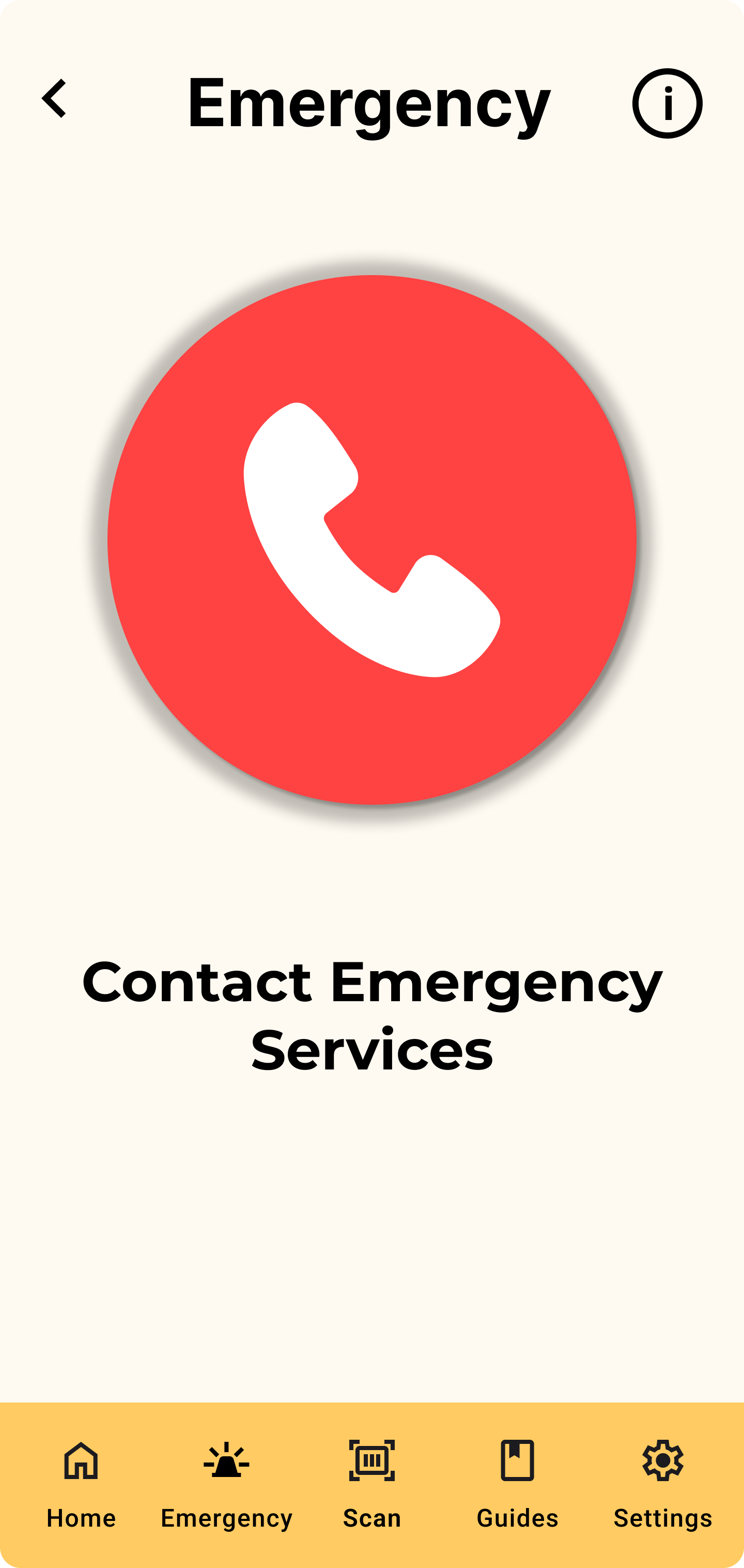
Emergency
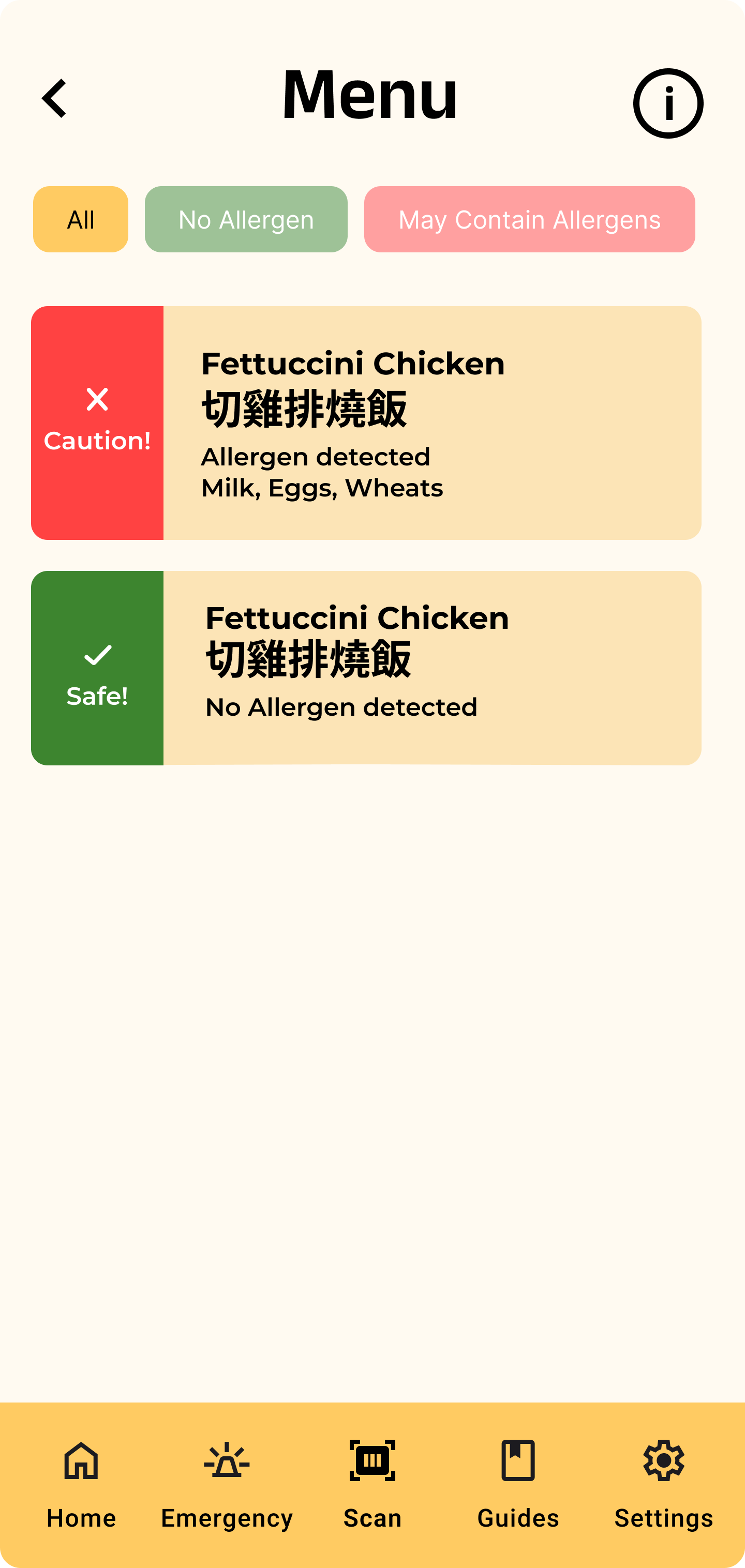
Menu Results
Learnings
What I initially thought users wanted turned out to be different from what they actually needed, which is why constant user testing was essential to gain a true understanding of their needs and preferences. Continuous iterations were necessary to ensure consistent progress and to stay on track with time, especially during the app design and refinement process. Also, working with a large team of 8 people was challenging, it required consistent communication and collaboration to ensure everyone was aligned with the project’s vision and goals.
Looking Ahead
Prioritizing clearer communication channels and project management tools will help streamline workflows. While emphasizing more early-stage user testing will allow for capturing of valuable user insights before making significant design decisions. Also, engaging users earlier and more frequently in the process will ensure their needs are better understood, leading to more effective time management and a more user-centered design approach in the future.
Software Used
Figma, Expo, GitHub